Attack of the little people
September 18, 2011 Leave a comment
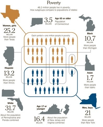
Where did they come from, the little people? Like a horde of replicants they have streamed forth to cover the world of infographics. No trendy depiction of any statistic related to humans is complete without the little people. Consider todays freshly populated example, from our favorite whipping boy, the New York Times.
The graphic is an attempt to put “into perspective” the numbers of people in poverty in the US. It does this by rounding up a bunch of little people, and penning them in various corrals that seem to have something to do with states or demographic groups. Hard to tell, since it is an expository jumble.
Let us ask a few questions of this graphic. First, the question that we ask of every such graphic: does the point leap out at you, in a flash of effortless cognition? Uh…lets see, half the people in poverty live in New York, and half in Texas? Fail!
Some more questions. If the orange little people are women and girls, why are they all wearing men’s business suits, albeit in a saucy feminine color? And do all the impoverished women and girls live in Texas? Rick Perry, are you aware of this? The state could at least provide more appropriate apparel for those in need. If you are a woman or girl, going to a job interview in an orange men’s business suit is not advisable, especially in Texas.
There seem to be a lot of impoverished white people (31.7 million), but amazingly, none of them live in Texas or New York. And if you think that is amazing…wait for it…none of them are men, boys, women, or girls. Maybe they are little people.
Ok, but here is where it really gets crazy. There are 16.4 million aged 17 or younger in poverty. But evidently none of them are girls or boys!
What is the lesson? The little people are no substitute for clarity of expression. The artist is to be commended for attempting to make the numbers more meaningful, but the exercise is doomed from the start. First of all, there is a fundamental difficulty in trying to carve up a total population (those in poverty) into a large number of overlapping sets. To be an accurate depiction, the corrals (technically, we call these Venn diagrams) should contain the correct number of little people, but so also should the intersections between two or more corrals (e.g., Asian and male and living Texas). Easier said than done (and it wasn’t that easy to say). Second, comparisons with state populations are problematic, since most americans have only a dim sense of the population of any state, even their own.
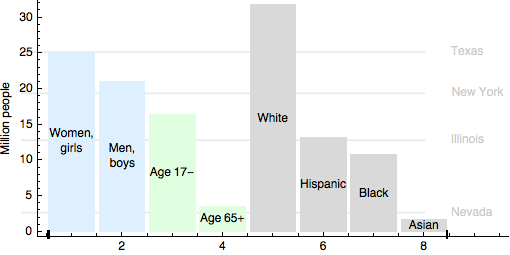
As is so often the case, traditional methods of data representation are perfectly adequate, and much clearer than the sad corrals of little people. Below is my quick draft of a bar chart of the same data. I have used different colors to group the different sorts of comparisons (gender, age, ethnicity), and as sop to the New York Times, included horizontal lines indicating populations of a few states (source http://quickfacts.census.gov/qfd/index.html).
I hope you will agree that though my chart may be conventional, it is clear, and allows the viewer to make the comparisons that the Times felt were important.
The lesson? Beware the invasion of the little people. They look cute, and you figure they are so small they can’t do any harm. But invite them into your graphic, and they can create havoc. Advanced lesson: Venn diagrams are tricky to depict when many categories are involved.
Sources:
New York Times
The Impoverished States of America
By TOM KUNTZ and BILL MARSH
Published: September 17, 2011
http://www.nytimes.com/2011/09/18/sunday-review/the-impoverished-states-of-america.html
State populations in my chart: http://quickfacts.census.gov/qfd/index.html).


