Pump up the volume!
February 5, 2012 1 Comment
One of the most egregiously deceptive practices in graphology is what we might call “dimension boosting.” Like the use of a performance drug in sports, it is an effort to gain un unfair advantage by playing outside the rules. Usually this crime consists of using the width of a two-dimensional figure, such as a circle or a square, to depict a one-dimensional quantity. But as the width increases, the area, which is what we perceive, grows as the square of the width. With this device, a small difference can be made to look much larger. If the plotted quantities differ by only a factor of two, their areas will differ by a factor of four.
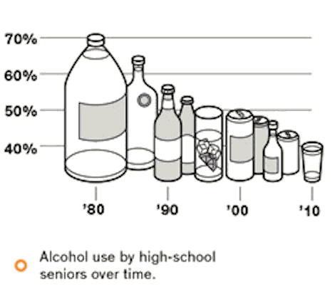
That is bad enough, but sometimes the criminal decides to do all the way, and throw in not one but two extra dimensions! In other words, they depict a one dimensional quantity with a three-dimensional object. Below is an example from a recent edition of the Sunday New York Times Magazine. It illustrates the decline of drinking among American teenagers over the last three decades.
Now we will perform a little test. Quickly, without looking at the axes, look at the two images at the beginning and end of the time interval and tell me by what factor drinking declined over that period. Got your answer? OK. Lets review. Well… in 1980 it looks like a 1.5 liter jug, while in 2010 they evidently had one shot glass (3 ounces?). You can fit about 17 shot glass servings in a 1.5 liter bottle. A 17x decline! Wow! Those kids sure have cut back!
But suspecting that todays teens are not quite so abstemious, and having been burned by criminal graphologists before, we examine the plot more carefully. First, we notice that even though the little bottles and glasses vary in not one, not two, but three dimensions, the axis on the left is a simple linear scale. Presumably the top of each vessel is the relevant aspect. Also, the axis is labeled in %. On that basis we realize that the incidence of drinking has only declined from 70% of teens to 40%, a decline of only 1.75x. An impressive decline, but not 17x.
Now that this graph has been caught red-handed, and we have it in a holding cell while it calls its lawyer, we can investigate further. Notice that the vertical axis only goes down to 40%? That is another devious trick to exaggerate the magnitude of a difference. If the axis had extended all the way to zero, the difference between 1980 and 2010 would not seem quite so impressive. (that would provide what we call a “ratio scale,” for the technically inclined). And since we are plotting a fraction of teenagers, maybe it would be fair to extend that axis all the way from 0 to 100%, further reducing the apparent magnitude of the change.
And another thing: why are the bottoms of the bottles and glasses jumping all over the place? If the top is meant to indicate the value, it would only be fair to keep the bottom stationary.
And while it feels like piling on, what is going on with the horizontal position of the containers? Their positions seem to jump around a bit, and there are different numbers in each decade. Did they forget to make the measurement is certain years? Or is the artist just exploiting their “artistic license?”
This graph is an instance of what is often called an “infographic.” An infographic is to a graph what an infomercial is to information. A bastard form in which information takes second place to entertainment or marketing. Look! Little bottles! What fun! One could imagine a form in which entertainment was provided, but truth was retained, but regrettably that is rarely to be seen.
In the printed version of the magazine, this graph is attributed to O.o.p.s. They should be ashamed. But the Times cannot escape the blame for this many-count indictment of graphical crime.
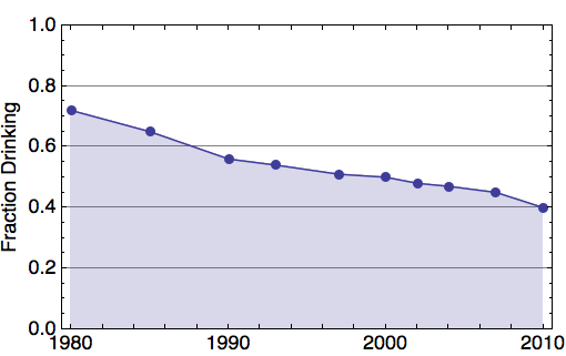
For completeness, we show a less entertaining but more accurate plot of the same data. It shows the full range from a fractions from zero to one, and does not introduce extraneous dimensions. The change in teenage behavior is significant, but not exaggerated by multidimensional trickery.
Reference:
New York Times
Well: The Kids Are More Than All Right
By TARA PARKER-POPE
Published: February 2, 2012
http://well.blogs.nytimes.com/2012/02/02/the-kids-are-more-than-all-right/


NYT graphics are first rate, including those in this article. For me, the witty embellishments in these were no exception, even if they were a tiny bit of a challenge to properly evaluate their trend lines. I felt treated to something special and they even brought a genuine smile to my face. It’s nice to see good work, it’s even nicer to see good creative work outside the normal bounds of convention. I’m not worried about editorial subterfuge here, although I will remain vigilant.